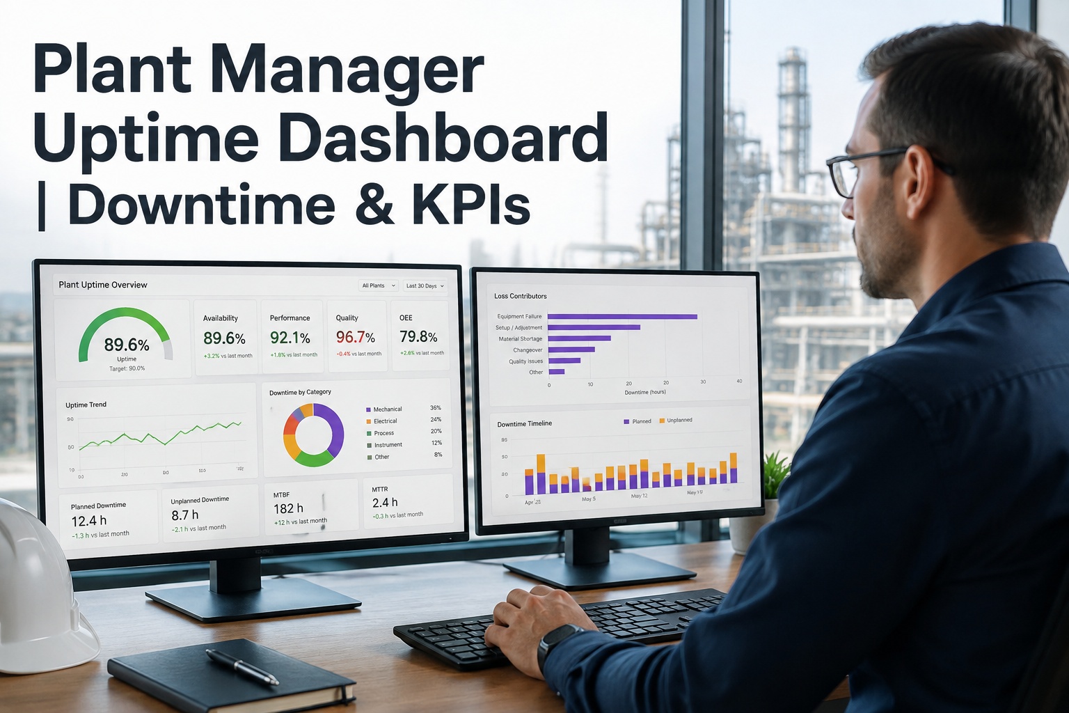
Plant Manager Uptime Dashboard | Downtime & KPIs

By Riley Quinn on August 31, 2026

plant-manager-uptime-dashboard

A plant manager's morning usually starts with the same question: what happened on the line overnight, and is today's schedule still realistic? Too often the answer means pulling three different reports — one for downtime, one for maintenance status, one for output — before a clear picture emerges. Most plants track around 37 KPIs across their systems, yet high-performing operations limit their manager-level dashboard to the 8-12 that actually drive daily decisions. Book a free demo to see a dashboard built around those, not everything at once, on a single connected screen.

Plant Uptime Dashboard
Live — updated this shift
OEE
78%
Uptime
94%
MTTR
42m
PM Compliance
91%

Why 37 KPIs Is the Wrong Target

The instinct when building a plant dashboard is to track everything the CMMS can measure. In practice, the industry average sits around 37 tracked KPIs per plant, but high-performing plants limit the manager-level scorecard to 8-12 metrics that map directly to daily decisions — everything else either belongs at operator level or gets reviewed monthly, not daily. A dashboard that shows everything shows nothing clearly.

The fix isn't collecting less data overall — it's being deliberate about which numbers earn a permanent spot on the screen a plant manager checks every morning.

Matching KPIs to the Right Review Cadence
Daily — Operator
OEE, downtime, throughput
Weekly — Plant Manager
MTBF, MTTR, PM compliance, backlog
Monthly — Leadership
Cost per unit, asset ROI, safety days

A plant manager's dashboard sits squarely in the weekly tier — enough detail to spot trends, without the daily noise or the monthly strategic lag.

Breaking Down OEE: Where the Losses Actually Hide

OEE is widely treated as the single most important plant metric because it combines three separate loss categories into one number. Most manufacturers target 85% as world-class, with 60% considered typical and anything below 40% signalling a serious improvement opportunity. The formula is simple, but knowing which of the three factors is actually dragging your number down is where the real diagnostic value sits.

OEE = Availability × Performance × Quality
Availability
Scheduled time minus downtime, as a share of scheduled time
Lost to: breakdowns, changeovers, waiting for parts
×
Performance
Actual output vs theoretical maximum while running
Lost to: minor stops, reduced speed, small delays
×
Quality
Good parts produced as a share of total parts made
Lost to: defects, rework, startup rejects
Example: 91% availability × 95% performance × 98% quality = 85% OEE — world-class, and it took all three factors performing well to get there.

Chasing availability alone while performance or quality quietly slips is a common trap — the dashboard needs to show all three, not just the headline number.

MTBF and MTTR: The Two Numbers Behind Uptime

Availability — the first factor in OEE — is really the product of two underlying maintenance metrics: how often things break, and how fast they get fixed. Tracking these separately makes the diagnosis clearer than watching uptime alone.

A plant with high MTBF but slow MTTR has infrequent but disruptive failures. Low MTBF with fast MTTR points to frequent small issues a team has gotten efficient at fixing — a different problem entirely.

MTBF
Mean Time Between Failures
How long an asset typically runs before failing. Higher is better — it means fewer breakdowns interrupting the schedule.
MTTR
Mean Time to Repair
How long it takes to get a failed asset running again. Lower is better — it means less production time lost per incident.

Turning Downtime Data Into Action, Not Just a Chart

A dashboard that shows downtime trending up is only half useful — the value is in connecting that trend to what's actually causing it and what work order addresses it. OxMaint pulls uptime, downtime cause codes, PM compliance and maintenance backlog into one live view, so a plant manager isn't reconciling separate reports before a shift meeting. Sign up free and connect your first line to see the picture start forming.

See Your Plant's Real-Time Dashboard
Watch how OEE, downtime and maintenance KPIs come together into one live view built around your own lines.

Expert Perspective: Building a Dashboard People Actually Use

KPIs that are published but never discussed are decoration, not management tools. A dashboard earns its place in daily operations by being reviewed on a set cadence — daily huddles for operational metrics, weekly reviews for reliability trends, monthly business reviews for cost and strategic numbers. Without that rhythm, even the best-designed dashboard ends up ignored on a screen nobody looks at.

Fewer Metrics, Reviewed Consistently
8-12 metrics reviewed every week beats 37 metrics reviewed never. Cut the scorecard before you build the dashboard.
Root Cause Over Raw Numbers
Downtime hours alone don't fix anything — the dashboard needs to connect the number to the cause code and the fix.
Different Views for Different Roles
Operators need this shift's status. Plant managers need this week's trend. One screen rarely serves both well.
Get these three right and the dashboard stops being a reporting exercise and starts being how the plant actually runs.

What Good Downtime Data Actually Looks Like

Raw downtime hours tell you there's a problem. A useful downtime dashboard tells you which machine, which cause category, and how that compares to last week — turning a number into a decision. Cause-coded downtime, reviewed weekly against the maintenance backlog, is what actually shifts a plant from reactive firefighting to planned improvement. Sign up free and start coding your downtime causes to see the pattern emerge.

A Typical Downtime Loss Breakdown
Breakdowns
38%
Changeovers
24%
Minor Stops
20%
Waiting on Parts
12%
Other
6%
Illustrative breakdown — your own cause-coded data will show where your plant's hours actually go, which is usually the more useful number.

Once causes are visible, the highest bar on the chart is usually the clearest starting point for where maintenance attention should go next.

Getting a Live Dashboard Running

Standing up a connected uptime dashboard doesn't require ripping out existing systems. Start by connecting your CMMS work order and downtime data for your most critical line, get the core 8-12 metrics visible, and expand line by line from there. Sign up free and connect your critical line first before rolling it out further.

A dashboard only earns its place once it becomes part of how decisions actually get made — a fixture in the daily huddle, not a screen glanced at occasionally. Set a standing weekly review of the 8-12 core metrics, note what changed and why, and let that rhythm keep the dashboard relevant instead of decorative. Book a free demo to see this built around your own plant.


Before You Build Your Dashboard
Pick your 8-12 metrics before choosing any tools or screens
Confirm each metric maps to a decision someone actually makes
Set who reviews the dashboard, and on what cadence, in advance
Start with your single most critical line, not the whole plant at once

Frequently Asked Questions

What KPIs should a plant manager's dashboard actually show?
A focused plant manager dashboard typically covers 8-12 metrics: OEE, uptime/availability, MTBF, MTTR, PM compliance, maintenance backlog, downtime by cause, and cost per unit are common starting points. The goal is a scorecard reviewed weekly, not an exhaustive list of every metric the CMMS can calculate — plants tracking 30+ KPIs at manager level usually find most go unreviewed.
What's considered a good OEE score?
Most manufacturers treat 85% OEE as world-class, 60% as typical for the industry, and anything below 40% as a sign of significant improvement opportunity. OEE combines availability, performance and quality, so a below-target score is best diagnosed by checking which of the three factors is actually driving the shortfall rather than treating OEE as one undifferentiated number.
How is downtime different from OEE in a dashboard?
Downtime is a raw measure of time lost to stoppages, while OEE combines downtime (as part of availability) with performance and quality losses into a single composite score. A dashboard showing downtime trends alone can miss losses from running slow or producing defects — tracking both together gives a fuller picture of where production capacity is actually being lost.
Can OxMaint connect to our existing PLC or SCADA data?
OxMaint is built to work alongside your existing maintenance and asset data, and can incorporate downtime and production data from connected systems where available. The core dashboard runs from CMMS work order, PM and asset data even without a PLC or SCADA connection, so plants can start with maintenance-driven KPIs and layer in production system data as connections are added.
How long does it take to get a working dashboard live?
Once your asset register and work order history are in the platform, core KPIs like PM compliance, MTBF and MTTR are visible immediately since they're calculated directly from existing maintenance data. Most plants get a working dashboard for their first critical line running within days, then expand line by line as more data connects rather than waiting for a full rollout to finish.
Give Your Plant One Dashboard That Matters
Connect uptime, downtime and maintenance KPIs into a live view built around your own lines. See it in a free 30-minute walkthrough.

Share This Story, Choose Your Platform!