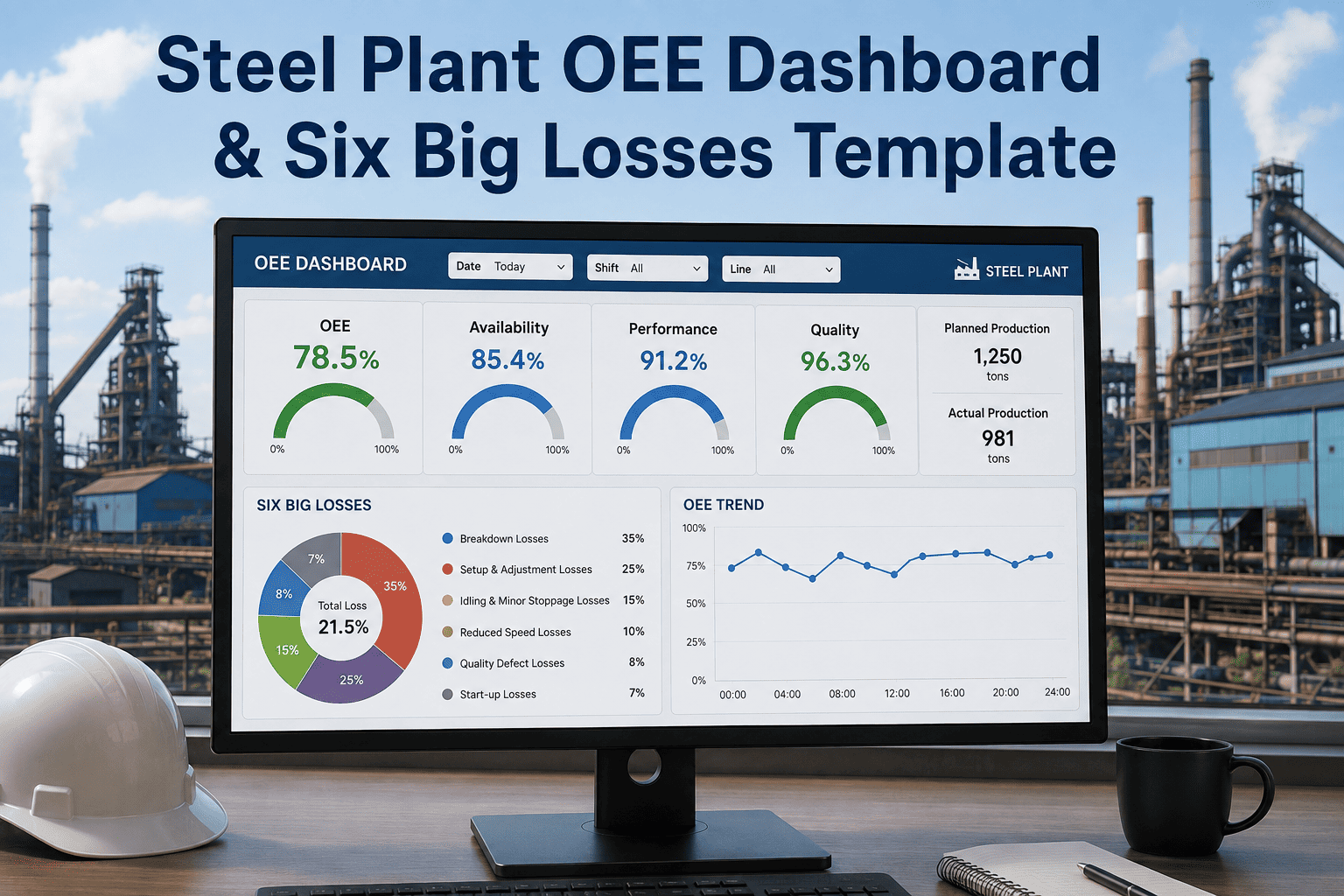
Two lines can both report 75% OEE and be in completely different trouble — one losing time to breakdowns, the other losing output to slow running nobody has flagged. The number alone can't tell them apart. What separates a scorecard from a diagnostic tool is whether it shows which of the six big losses is actually pulling the score down, and where on the benchmark scale that puts each line. Start your free trial on Oxmaint or book a live demo to see your OEE broken down loss by loss, line by line.
Where Does Your OEE Actually Sit?
OEE means little as a raw number without a benchmark to place it against. These four zones are the industry-standard reference points for judging any line's score.
The Six Big Losses, Ranked by Where They Hit
Every point lost off OEE traces back to one of six causes. Tracking them individually is what turns a single score into a list of things to actually fix.
Unplanned stops from mechanical or electrical failure, typically the single largest loss category in a steel plant.
Planned changeovers, tooling swaps, and calibration time that keeps the line stopped between runs.
Brief stoppages under a few minutes that rarely get logged individually but add up across a shift.
Running below rated speed due to wear, minor faults, or operator caution after a prior incident.
Scrap produced while a line ramps up to full speed and stable conditions after a stop.
Out-of-spec output during steady-state running, often tied to a specific asset or process drift.
OEE Dashboard Readiness
Before an OEE score goes on a plant scorecard, these five conditions should hold true. If any one is missing, the number is likely hiding more than it shows.
Where OEE Dashboards Get It Wrong
| OEE Problem | Root Cause | Fix |
|---|---|---|
| Score looks stable but output keeps missing target | Availability, performance, and quality are blended into one number | Each component tracked and displayed separately by line and shift |
| Small stops never show up as a real loss | Stoppages under a few minutes go unlogged or get bundled into idle time | Micro-stop tracking rolled into performance loss automatically |
| Same breakdown keeps recurring on the same line | Availability loss isn't linked back to the specific failing asset | Breakdown history tied to asset ID, surfaced as a repeat-failure trend |
| Scrap rate spikes with no clear pattern | Startup rejects and steady-state rejects logged as one quality number | Quality loss split between startup rejects and production rejects |
Before vs. After: Reading Your OEE Number
How Oxmaint Powers Your OEE Dashboard
A plant chasing one OEE percentage is always reacting after output has already been lost. Oxmaint tracks all six big losses against real work order and production data, so availability, performance, and quality loss are visible the moment they happen. Start for free and see your OEE benchmarked and broken down by loss, not just one score.
Breakdowns, setup, small stops, speed loss, startup rejects, and production rejects each get their own view.
Every line is placed on the Poor, Fair, Good, or World Class scale, updated as new data comes in.
Every availability loss event is tied to the specific asset, exposing repeat-failure patterns fast.
Micro-stoppages and running-below-rate periods are logged instead of disappearing into idle time.
Quality loss is split by cause, so ramp-up scrap doesn't hide a steady-state process problem.
Every line, shift, and asset can be compared side by side to prioritize where to act first.