Walk into most plants and you will find a dashboard on every wall — OEE on the shop floor, a weekly rollup in the supervisor's office, a quarterly deck for the boardroom. And yet the most common finding across hundreds of manufacturing sites is the same: these dashboards are structurally ignored. Operators glance past them. Supervisors check them out of habit, then open a spreadsheet anyway. The problem is rarely the screen — it is what's on it. A CMMS like OxMaint builds dashboards around the decision each role actually needs to make, not a wall of numbers nobody acts on.
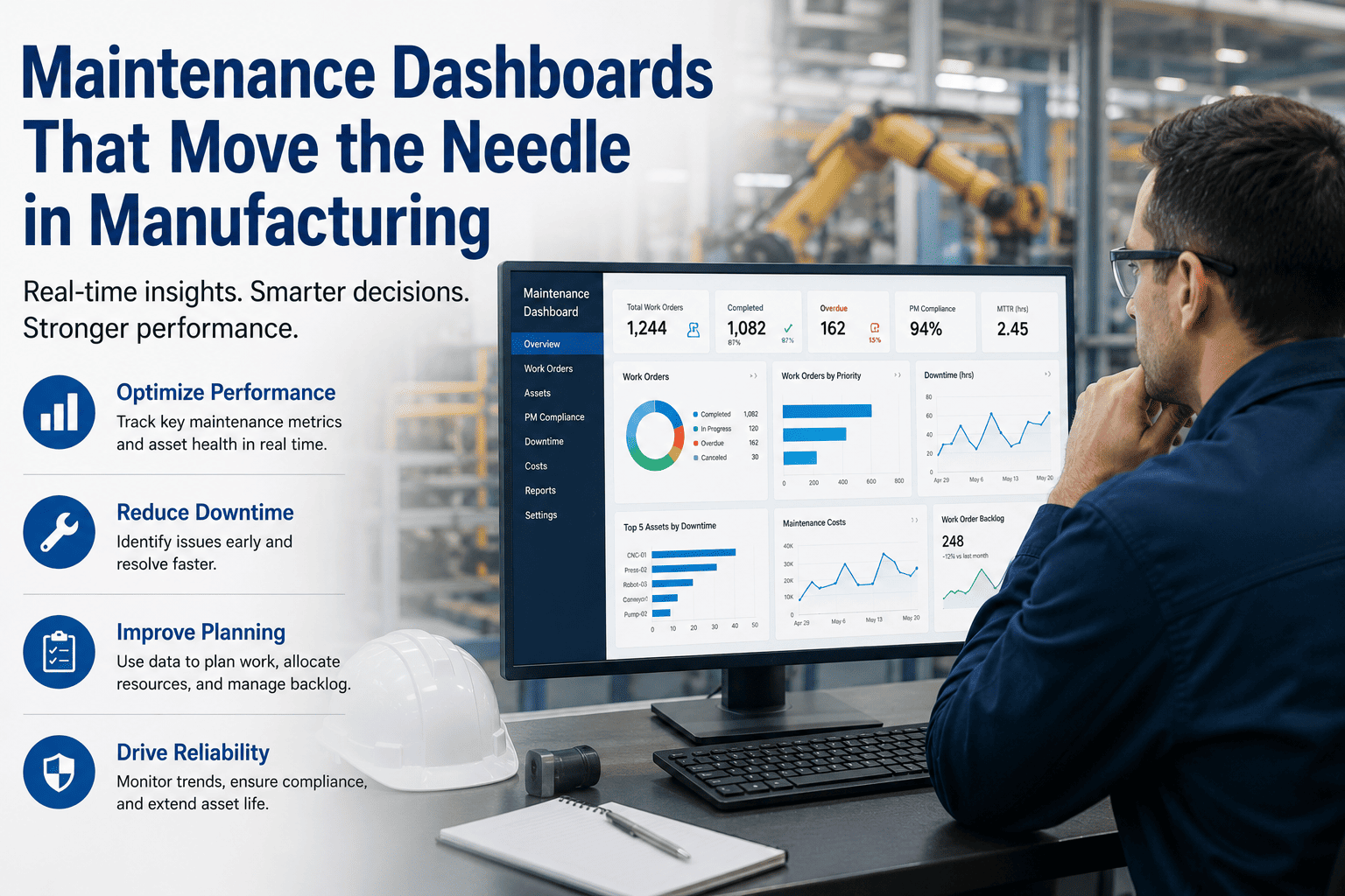
See Live Downtime, Cost-Per-Unit and Schedule Compliance in One View
Role-based dashboards calculated automatically from your work order data — no spreadsheets, no manual KPI math, no stale weekly export.
Why Most Maintenance Dashboards Get Ignored
The typical dashboard is built by committee. Every stakeholder asks for their preferred metric, and the result is a 20-number wall that nobody reads in full. Working memory can hold roughly five to nine things at once — past that, engagement drops sharply because the dashboard stops being a tool and becomes wallpaper.
The fix is not a better chart. It is fewer numbers, chosen because each one maps to a specific decision someone actually makes — and a different dashboard for each role, because an operator's decision cycle and an Operations Director's are not the same thing.
Vanity Metrics to Cut From Every Screen
Equipment Utilization %
Meaningless without context. Is 72% good? It depends entirely on shift pattern and production model. Replace with availability inside OEE.
Cumulative Output Count
Only ever increases through a shift and drives no decision while it's running. Replace with throughput against target, shown as a live delta.
Blended Uptime %
Hides unplanned downtime inside planned maintenance time. A plant can report 95% uptime while a recurring fault goes uninvestigated.
The Dashboard Each Role Actually Needs
Technician
Today's work queue, overdue PMs, and parts availability. Refreshed in near real time — this is what runs the next hour of work.
Supervisor
Schedule compliance, backlog weeks, and emergency work percentage across the shift. Reviewed every 5-15 minutes during active management.
Operations Director
Cost-per-unit, OEE trend, and MTBF/MTTR by site. Reviewed weekly or monthly, with financial impact front and centre.
A dashboard trying to serve all three audiences at once ends up serving none of them — too many KPIs for the technician, the wrong refresh rate for the director. Book a demo to see how OxMaint splits these views automatically from the same underlying work order data.
The Four KPIs That Actually Move the Needle
| Metric | Formula | World-Class Benchmark |
|---|---|---|
| Schedule Compliance | Completed on-time WOs ÷ Total scheduled WOs | 90%+ |
| PM Completion Rate | PMs completed on time ÷ PMs scheduled | 90%+ |
| OEE | Availability × Performance × Quality | 85%+ (most plants run 60-65%) |
| MTTR | Total repair time ÷ Number of repairs | Under 4 hours for critical assets |
Schedule compliance and PM completion are leading indicators — if compliance drops from 95% to 75%, MTBF decline and rising emergency work are predictable within 60 to 90 days. OEE and MTTR are lagging indicators that confirm whether the actions taken on the leading indicators actually worked. A dashboard with only one type leaves leadership either blind to what's coming or unable to confirm what already happened. Sign up free to see all four calculated automatically from your existing work order history.
Live Downtime: Why Real Time Beats Weekly Rollups
Root Cause, Not Just Duration
A downtime number without a reason code tells you something stopped, not why — and the why is what prevents it happening again.
Drill-Down, Not Data Dumps
The overview should answer what's happening at a glance. The detail behind it should sit one click deeper, not cluttering the main screen.
Colour That Carries Meaning
Green for normal, amber for needs attention, red for act now — consistent, not decorative, and never lost in a noisy shop floor display.
What Changes When Dashboards Actually Get Used
How OxMaint Builds Dashboards People Actually Use
Role-Based Views
Separate dashboards for technicians, supervisors, and Operations Directors, each showing only the KPIs relevant to their decisions.
Live Downtime Tracking
Downtime captured with reason codes the moment a work order opens, so root cause is visible without a separate investigation.
Automatic KPI Calculation
OEE, MTBF, MTTR, schedule compliance, and cost-per-unit calculated continuously from work order data, with zero spreadsheet formulas.
Multi-Site Rollups
Compare KPIs across every facility in a single executive view, ready for board-level reporting in one click.
Replace the Dashboard Wall With One Your Team Actually Uses
Live downtime, cost-per-unit, schedule compliance, and PM completion — calculated automatically and shown to the right role at the right time.
Frequently Asked Questions
How many KPIs should a maintenance dashboard actually show?
Around five to nine per screen. Beyond that, working memory limits cause engagement to drop sharply, and important signals get buried under metrics nobody acts on.
Should executives and technicians see the same dashboard?
No. Technicians need real-time, task-level views refreshed continuously. Executives need weekly or monthly trends with financial context. A single dashboard trying to serve both ends up serving neither well.
What is a vanity metric in a manufacturing dashboard?
A number that looks impressive but does not inform a decision — such as utilization percentage shown without context, or cumulative output that only ever increases during a shift.
Why does PM compliance matter if MTBF hasn't dropped yet?
PM compliance is a leading indicator. A decline typically predicts falling MTBF and rising emergency work within 60 to 90 days, giving leadership time to act before the lagging metrics confirm the problem.
What is considered world-class OEE for a manufacturing plant?
85% or above is generally considered world-class, while most manufacturing plants operate between 60% and 65%. The trend over time matters more than the absolute number on any single day.