A kiln quietly degrading toward 68% OEE this week won't show up as a problem until the month-end report — by which point the bearing wear or refractory hot spot behind it has already burned through hundreds of production hours at reduced output. The plants that catch it instead are the ones tracking the right numbers in real time, not reconstructing them from spreadsheets once a month. These are the 10 KPIs that separate a cement plant running to plan from one absorbing preventable downtime every quarter. Sign up for a free trial or book a demo to see all ten live on your own asset data.
The 10 KPIs a Cement Maintenance Dashboard Needs
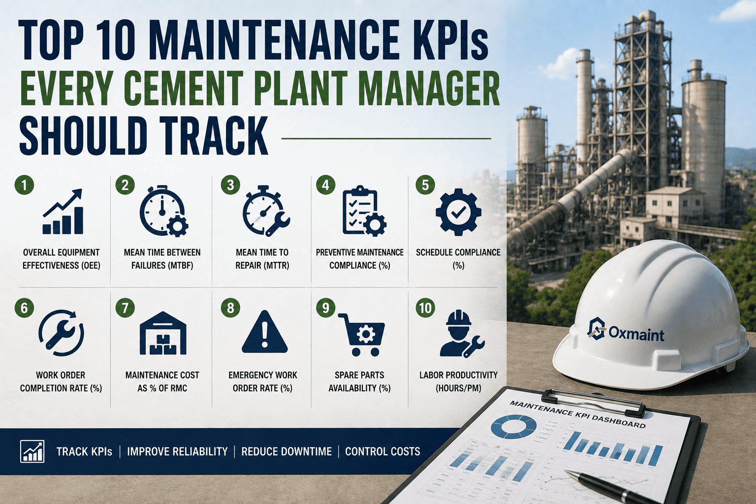
Each of these answers a different question about your maintenance program — how well equipment runs, how fast the team recovers from failure, and how much all of it is costing per tonne of clinker.
Availability × Performance × Quality for the kiln and mill system. World-class benchmark sits at 85-92% for integrated plants.
Average operating time between breakdowns, tracked by asset category to catch a bearing failing earlier than expected.
Average time from failure to restored operation, tracked by maintenance team to isolate response, parts, or execution delays.
Share of scheduled preventive maintenance actually completed on time. Every 10% drop typically precedes a 15-20% rise in failures.
Share of work that's scheduled versus emergency, classified at creation. Top-quartile plants keep reactive work under 30%.
Hours the kiln actually operated against total scheduled hours. Modern dry-process kilns benchmark at 88-93%.
Total maintenance spend divided by clinker output, the single number that ties reliability directly to production cost.
How long open work orders have been waiting, a leading indicator of a maintenance program falling behind before failures spike.
How often a needed part isn't on hand, directly driving MTTR up on critical assets like kiln bricks and mill liners.
Share of work orders created as unplanned emergencies, the clearest signal of how much of the program is still reactive.
Leading Indicators vs. Lagging Indicators
Some KPIs tell you what already happened. Others warn you before it does. A dashboard built only on lagging indicators means every insight arrives too late to act on.
PM compliance and backlog age move first, flagging risk before a failure occurs.
MTBF, MTTR, and OEE confirm what already happened, useful for trend and benchmark comparison.
Cost per tonne and stockout rate connect maintenance performance directly to plant economics.
Planned-to-reactive ratio and emergency work order rate show whether the program is proactive or firefighting.
Monthly Spreadsheet vs. Real-Time Dashboard
How Oxmaint Tracks These KPIs for You
Every KPI on this list is only as good as the data feeding it. Oxmaint calculates MTBF, MTTR, OEE, PM compliance, and cost per tonne directly from live work order and asset data, so there's no manual reconstruction at month-end. Sign up to see your first dashboard live within the hour.
MTBF, MTTR, OEE, PM compliance, and planned-to-reactive ratio calculated live from work order and sensor data, with no manual entry.
Every KPI links directly to the assets, work orders, and technicians behind it, so a number leads to an answer, not another spreadsheet.
Technicians see today's priorities, planners see backlog aging, and managers see monthly MTBF, MTTR, and cost per tonne trends.
Each KPI compared against cement industry targets, showing exactly where your plant sits against top-quartile performance.