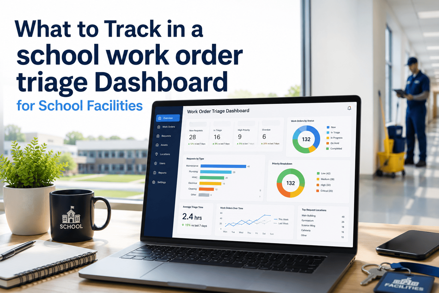
Summer turnover gives a housing team a few weeks to reset hundreds, sometimes thousands, of rooms before the next class of students arrives. Run it off a spreadsheet and a clipboard, and the same problem repeats every August: nobody can say which rooms are actually move-in ready until someone physically walks every hallway again. A dashboard built specifically for turnover season changes that by surfacing exactly which rooms are inspected, which are mid-repair, and which are sitting untouched — in real time, building by building. Housing teams running OxMaint's turnover dashboard catch HVAC, plumbing, and safety gaps before move-in day instead of during the first week of complaints. See the dashboard built for your own building list by starting a free trial or by booking a turnover season walkthrough.
What a Turnover Dashboard Should Actually Show You
Not every metric belongs on a turnover dashboard. The ones that matter are the ones that tell a housing director, at a glance, whether a building will be ready by move-in day — or which rooms need attention right now.
Room Status, Live Across Every Building
The single most useful view on a turnover dashboard is a room-by-room status board. It replaces the question "are we on track?" with an actual answer, visible the moment anyone opens the screen.
Six Categories Every Turnover Dashboard Should Track
A turnover dashboard built around these six categories gives a housing team the same level of visibility on day one of turnover as on the last day before move-in.
The Same Dashboard, Different Views by Role
A housing director, a maintenance supervisor, and a front-line technician all need different slices of the same data. Building one dashboard with role-based views keeps everyone aligned without forcing anyone to dig through irrelevant detail.
What a Spreadsheet Misses That a Dashboard Catches
Spreadsheets work fine for small lists. At turnover scale, across hundreds of rooms and several buildings, the gaps below show up almost every season.
| Gap With a Spreadsheet | What Happens | How a Dashboard Closes It |
|---|---|---|
| No real-time update from the field | Status is only as current as the last manual entry | Technicians update status from a mobile device on the spot |
| One shared file edited by many people | Overwritten entries, version confusion, lost rows | Each room is its own record, updated independently |
| No automatic safety flagging | A restrictor or smoke detector issue is buried in a row | Safety items are tagged and surfaced in their own view |
| No historical comparison | Recurring issues from last year go unnoticed | Repair history is attached to the room across years |
Replace the Clipboard With a Live Dashboard
Every room becomes a tracked asset in OxMaint — inspected, repaired, cleaned, and signed off, with a status visible to the whole housing team without anyone walking the building to check.
Tracking Turnover Progress Day by Day
A dashboard is only useful if it shows momentum, not just a snapshot. Tracking the pace of completion against the move-in deadline turns a vague sense of "behind schedule" into an actual number a director can act on.
| Week of Turnover | Target Rooms Complete | Common Bottleneck | Dashboard Signal |
|---|---|---|---|
| Week 1 | 20% | Furniture and junk removal from vacated rooms | Pending inspection count stays high |
| Week 2 | 45% | HVAC parts backorder | In-repair count rises sharply |
| Week 3 | 70% | Safety item rechecks after initial repair | Flagged safety item count should be falling |
| Week 4 | 95% | Final cleaning crew scheduling | Move-in ready count nearing total room count |